Not my photographs in many cases, but my design.... my copy... my finished art. That will save you.
A little campaign for Rod Kristic, then at Roberts... now with View Real Estate. I haven't done any work for him for more than a decade. He's one of the good guys in real estate.


Pat, Graham, me and old Dickie Doodle at Nanna's. Nanna 'adopted' Dickie after inviting him to spend Christmas with her family. Nanna and Paddy had eight kids of their own and still had room to take in three more mouths.


I never met the dog, but John was a cousin living in the North with school teacher mum and school Principle dad. They were the fanciest people we knew. They had a Toyota Crown!... and two other kids, Jamie and Janine.


John again. his time with mum, Esma and dad, Larta... before he up graded to the Dart I'm assuming.


Cousins, Rod, Janine, John (again), Karen and Ros. Looks like Uncle Beau's fibre cement home at
41 Bayview Road, Lauderdale. It's changed a bit.


I din't have a clue who these ladies are. They're guests at Auntie Eille's so I'm assuming they're artistic types or there to buy her jewlery.


Auntie Eillie's kitchen was a caravan that dad had attached to the house. So cool. Would have been cooler if this was her caravan. It's not though :)


I've never see a service Station. more beautiful than this old beauty in Argyle Street. I love old stuff. I even love old people.


Regatta Day in Hobart. Bridge-building in the background. Feel lucky to have found this image in Auntie Eillie's stuff.
Sfumato Hair has had some gun hairdressers. These were competition submissions for three of them. Matt now owns the salon, having taken over from hairdressing identity, Wayne Chappell.


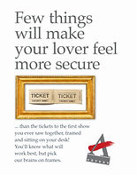
A framing campaign for one of my favourite clients ever... Roy Leeman at Artery.
Roy let me do some fun stuff that worked... and didn't cost a bomb.


A little bit of fun with cheese packaging. No AI when these were done, so painstakingly etching cows and ducks to add a little quirk. Still on the shelves unchanged nearly 20 years on.


A lot of my best work at Roberts is still in draft form. I like these to look at, but I'm happier with the copy than I am with the design. These pieces were used for a few years.


This is another reason I liked working with Roy. He cared about stuff... and he cared enough to do something about it. He had ideas and he carried through.


Just bits and pieces... because I like the look of them.

The hospital asked me to fix up their signs. I gave them a system with coloured guidelines on the floor to make it easy for people to find the lift they needed to get where they're going, without the guesswork that embarrasses them and results in a need to place unfriendly signs all over the hospital stating that "We will not tolerate abusive behaviour'.
They just printed the signs. No lines.
That was 15 years ago. I noticed on a recent stay after breaking my back, that they do have at least some directional lines on the floors now:)

Flyer Front
Did a couple of fun things for Digital First Cleaning.
This flyer... that was odd enough to get people turning over to read the copy. Also very cheap to produce:)
Similar signage was used on a vehicle.
And a flyer written in a Scor-ish accent.


They didn't think so, but this is probably the best (lengthy) piece of copy I've written for a client.
I love the logo too... and the strapline that goes with it.
The client mucked me around forever. They still exist, but their website could do with as few less cliches and a bit more of this.
The brochure didn't get a run.
Disappointed.


I've done a few business cards and other stationery.These are appropriately straight, but I'll put up some mad cards that Sfumato used when I get around to it:)